Le Bloc
Art Direction, Design
Le Bloc provides a way to wear your favorite letters, words, or names. The collection is comprised of bracelets, necklaces and rings featuring blocs engraved with a single letter in the finish of your choice. I led the art direction and vision for the brand, creating a unique voice and character that parallels the playfulness of the company’s concept.


Goals
Le Bloc needed brand guidelines from scratch. This was a rare opportunity to define the groundwork for all aspects of the brand. This included work on a logo, typography, color palette, patterns, graphic language, packaging, photography style, signage and displays, and the voice.
Approach
The art direction was minimal and subtle, to allow the jewelry to shine. The typography was classic, utilizing serif and complimentary sans-serif styles. The colors were elegant and modern, bold and refined. The signature pattern was inspired by the concept of the brand, playing on the mix-and-match jewelry blocks. Original photos mixed with other fashion brands’ imagery exemplified the ideal style and mood for Le Bloc. The website introduced the brand through color blocks, airy design, and playful graphics.


Website

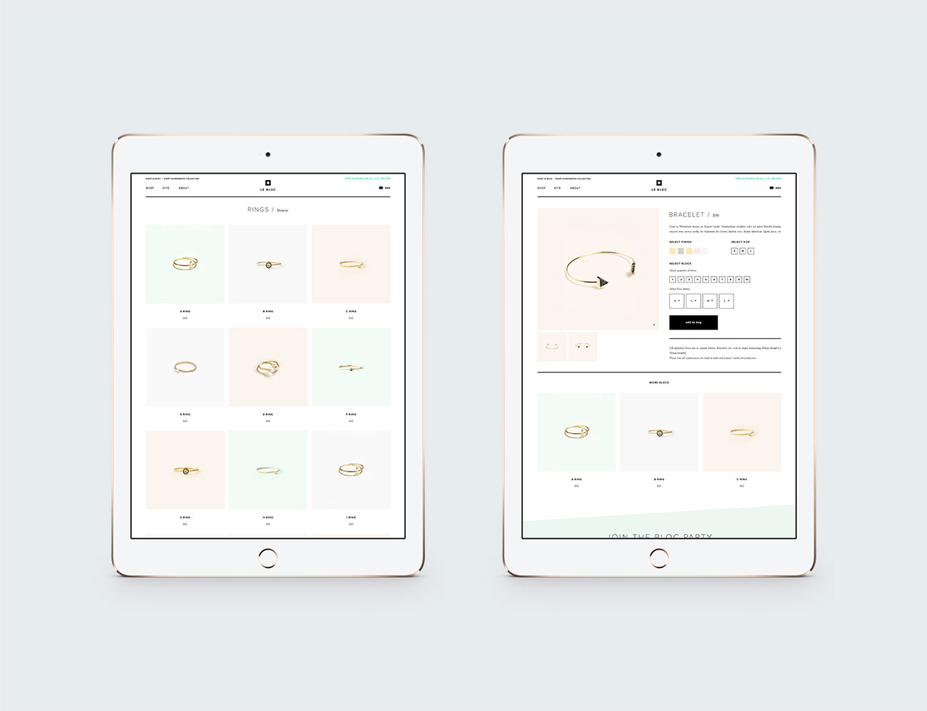
Website / Product Listing and Detail Pages
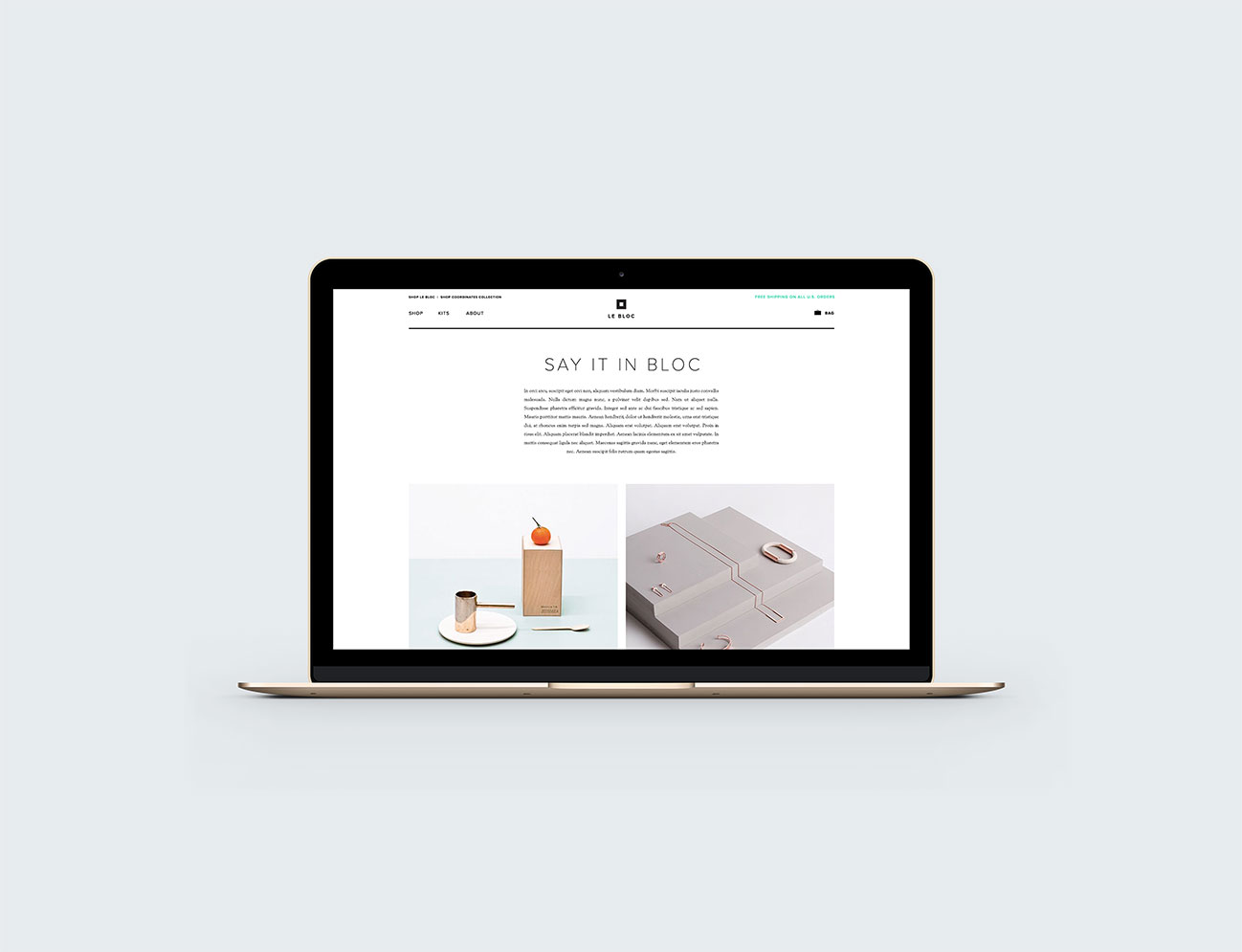
Website / Homepage

Website / About
Website / Build-your-own Kits

Emails

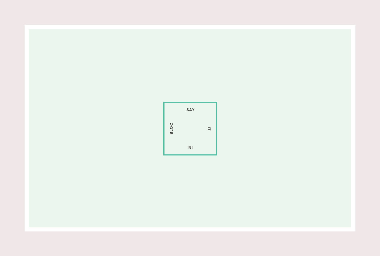
Signature Pattern

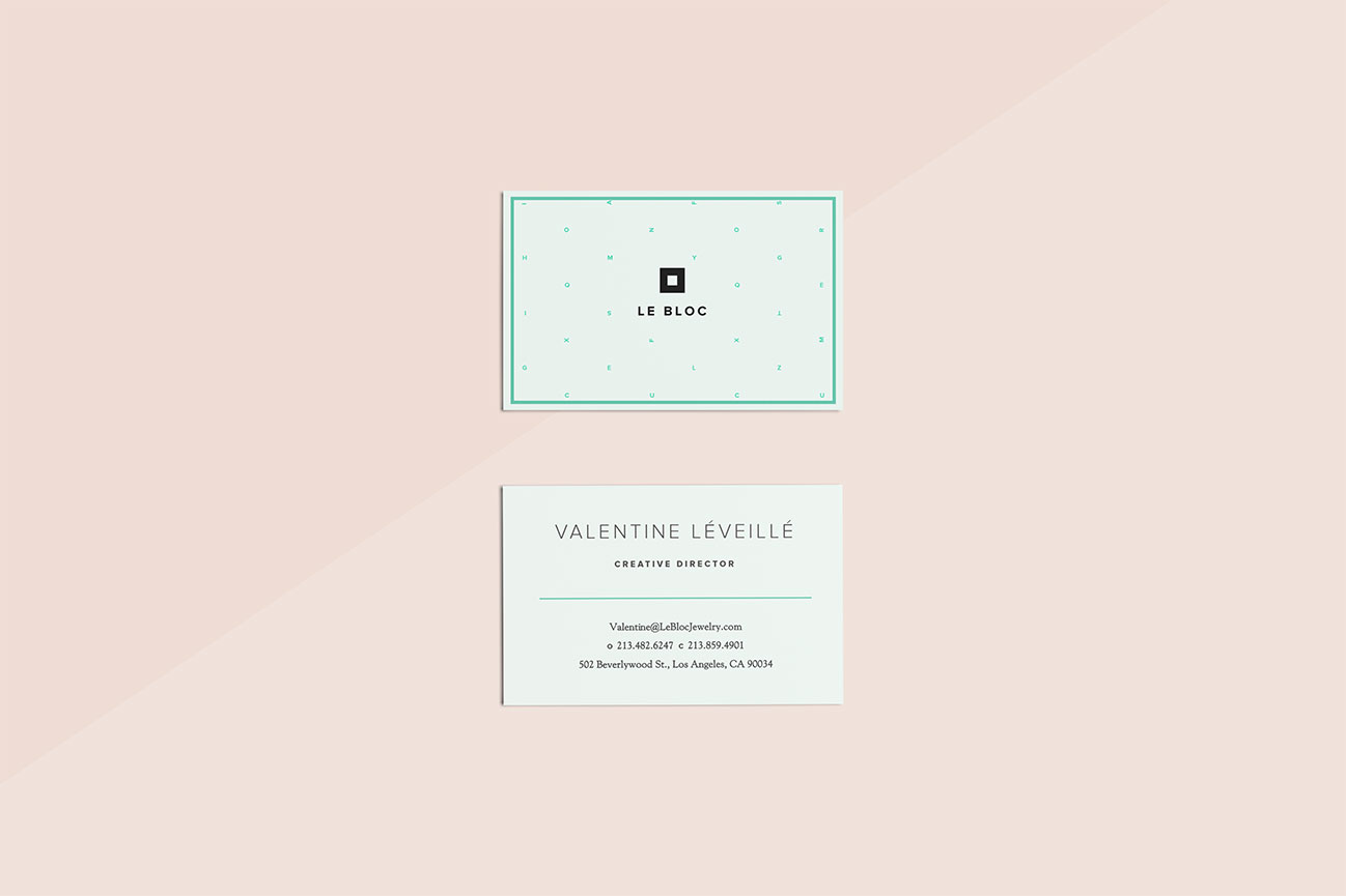
Business System

Brand Guidelines

Brand Guidelines / Color Palette and Paterns

Brand Guidelines / Lifestyle Photography

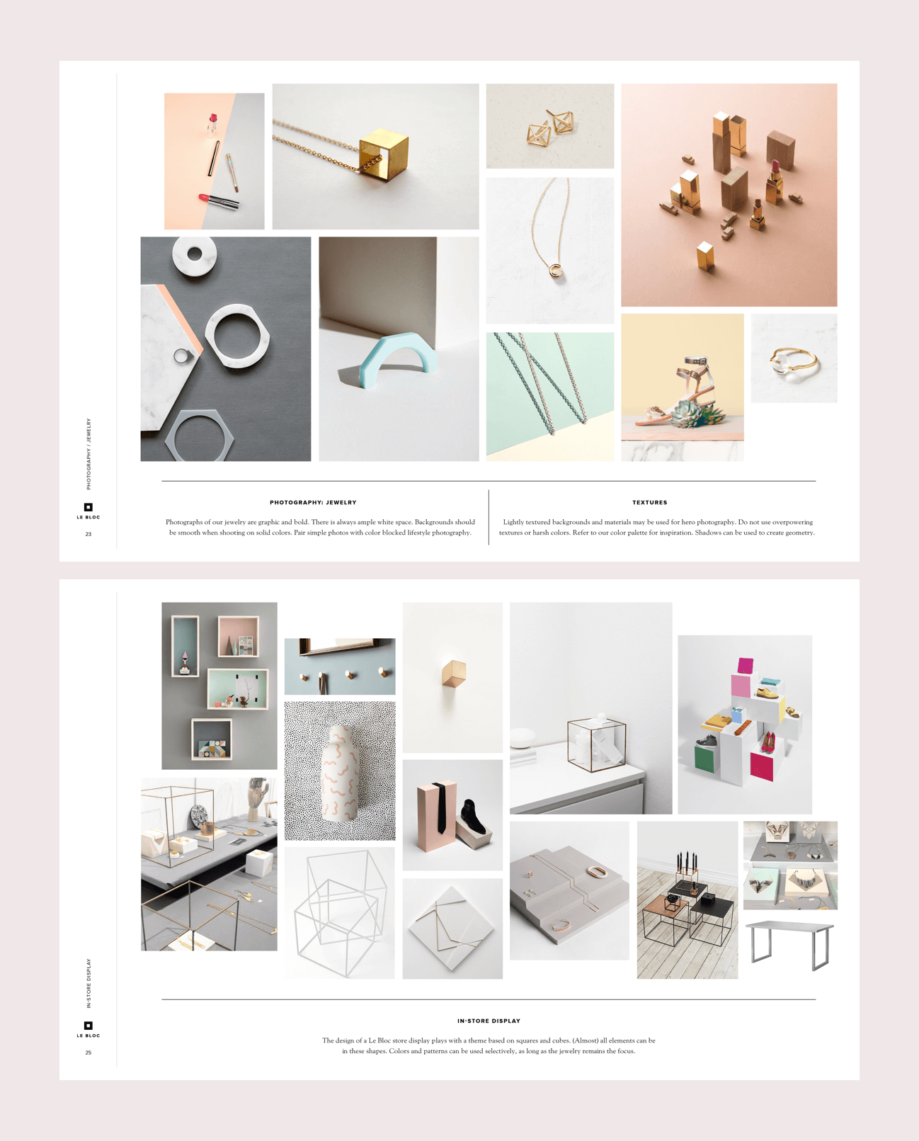
Brand Guidelines / Product Photography and In-store Display
Brand Guidelines / Packaging